


 Do you ever watch people and notice how many have an electronic device in front of them? Or observe a group of young people together, but individually on their phones?
Have you joined the ‘one word’ movement? Each year, you adopt one word that is to dominate your choices, your way of living and shift your focus to one particular area. I’ve heard the word ‘Intentional’ in this context. Being intentional about your thoughts, your focus, your conversations.
Well, I am going to challenge myself, and hopefully others to intentionally notice little details in our everyday life.
Do you ever watch people and notice how many have an electronic device in front of them? Or observe a group of young people together, but individually on their phones?
Have you joined the ‘one word’ movement? Each year, you adopt one word that is to dominate your choices, your way of living and shift your focus to one particular area. I’ve heard the word ‘Intentional’ in this context. Being intentional about your thoughts, your focus, your conversations.
Well, I am going to challenge myself, and hopefully others to intentionally notice little details in our everyday life.
 Last weekend, I saw a vanity license plate on a car. It spelled BLONDE, but the fun twist – it was mounted upside down on the car! I followed (chased) the car till I could get a good photo. Then I posted it on Facebook. The owner saw the post and commented that she loves seeing people point, smile, take photos and that, in turn, makes her happy.
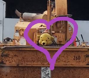
Our family works in real estate sale, so I notice houses. Sometimes, I drive down a street that I’ve traveled often, and all of a sudden, I notice a house that I’ve NEVER noticed in the past. Then I wonder, how could I have missed that house all the times I’ve driven on this street? That’s what this is about – taking notice of the mundane, ordinary – appreciating them and elevating them by taking note, taking a photo, and/or simply appreciating them.
Last weekend, I saw a vanity license plate on a car. It spelled BLONDE, but the fun twist – it was mounted upside down on the car! I followed (chased) the car till I could get a good photo. Then I posted it on Facebook. The owner saw the post and commented that she loves seeing people point, smile, take photos and that, in turn, makes her happy.
Our family works in real estate sale, so I notice houses. Sometimes, I drive down a street that I’ve traveled often, and all of a sudden, I notice a house that I’ve NEVER noticed in the past. Then I wonder, how could I have missed that house all the times I’ve driven on this street? That’s what this is about – taking notice of the mundane, ordinary – appreciating them and elevating them by taking note, taking a photo, and/or simply appreciating them.
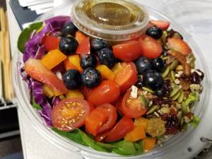 Today, I stopped at a fun food establishment – Grateful Chef. It is located just south of the downtown area and makes ‘Grab-n-Go’ meals and freezer meals. This photo is of the salad I purchased for my lunch. Just look at the visual presentation – juicy red strawberries, fat blueberries, cherry tomatoes, seeds, lettuce and savory dressing. Now imagine the explosion of flavor, the contrast of the crisp lettuce, crunch of the nuts and seeds, soft texture of the fruit, the unexpected contrast of the sweetness with the savory. I appreciate the work that went into this salad, chopping the items, arranging them in a visually appealing presentation that said abundance, health and deliciousness!
I plan to start Monday posts about Something-New-I-Noticed. I challenge you to see new things or old things in a new way and share with your world.
Today, I stopped at a fun food establishment – Grateful Chef. It is located just south of the downtown area and makes ‘Grab-n-Go’ meals and freezer meals. This photo is of the salad I purchased for my lunch. Just look at the visual presentation – juicy red strawberries, fat blueberries, cherry tomatoes, seeds, lettuce and savory dressing. Now imagine the explosion of flavor, the contrast of the crisp lettuce, crunch of the nuts and seeds, soft texture of the fruit, the unexpected contrast of the sweetness with the savory. I appreciate the work that went into this salad, chopping the items, arranging them in a visually appealing presentation that said abundance, health and deliciousness!
I plan to start Monday posts about Something-New-I-Noticed. I challenge you to see new things or old things in a new way and share with your world.
And if you’re noticing a house that is For Sale that you’d like info on – call the Eisenlauer Team.
515-979-2883.
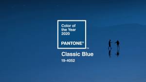 This is the 2oth year that
  As an appropriate contrast, Benjamin Moore’s color for 2020 is the First Light, as soft shade of pink. They release a whole palette of coordinating colors to go with the chosen color of the year. “The First Light is seen as a neurtral, subtle enough to go with anything, including beige.” I don’t think these two entities coordinate, but think about the walls of a room being the first-light-of-day pink with furniture the color of dusk – Striking!
 Another Color of the Year, is PPG’s Chinese Porcelain. They describe it as “a blend of cobalt and moody, ink blue that imparts calmness and restful sleep while also offering the spirit of hopefulness- a rare commodity in a restless world”
If you are considering re-painting any room in your home – the paint company websites are a great resource. They show colors that mesh together to help with coordination. They each have amazing tools that allow you to take a photos of your room, then see it in a freshly repainted hue! Check out a few.
Another Color of the Year, is PPG’s Chinese Porcelain. They describe it as “a blend of cobalt and moody, ink blue that imparts calmness and restful sleep while also offering the spirit of hopefulness- a rare commodity in a restless world”
If you are considering re-painting any room in your home – the paint company websites are a great resource. They show colors that mesh together to help with coordination. They each have amazing tools that allow you to take a photos of your room, then see it in a freshly repainted hue! Check out a few.
Recent Comments